
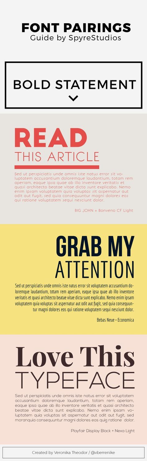
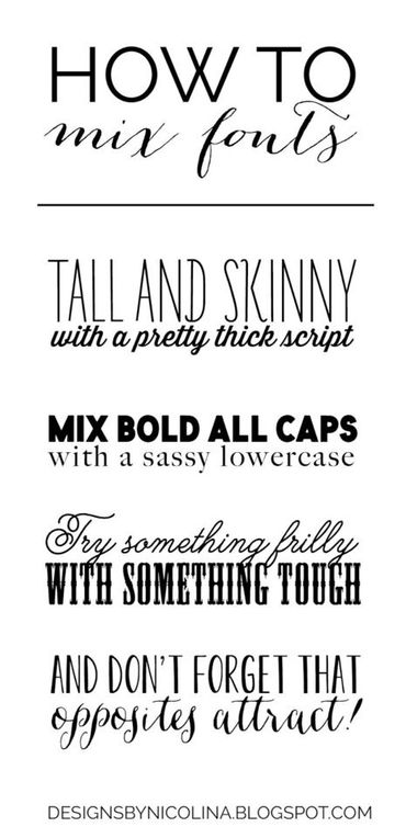
Serif FontSerif Fonts have serif lines on the ends of letters. Think newspapers and typewriters when you think of serif fonts.
|
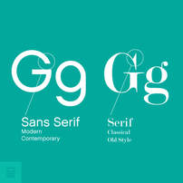
Sans Serif FontSans Serif literally means without serif. So these fonts do not have the lines at the end of each letter. They are more simple and more modern.
|
Decorative FontWhile this font may look pretty sweet, it's good to limit decorative fonts to titles or really large headings. Most are not the easiest to read, but they do add character to your pages.
|
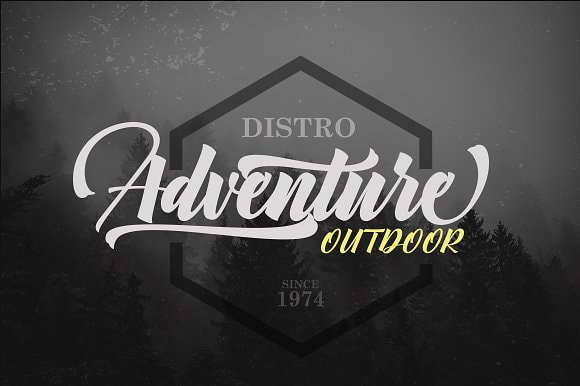
Script FontScript font looks like cursive or calligraphy. This can also act as a decorative font and should be used sparingly.
|
Type Check-List
1. Theme copy should be larger than regular body type with leading that is twice the point size. (14 point theme copy would have 28 point
leading).
2. Body type should be nine- or 10-point type (or larger, depending on selected font) with auto leading.
3. Caption type should be eight- point.
4. Group photos should begin with the name of the group, using a graphic device.
5. Scoreboard type should be eight point.
6. Portrait identifications should be eight point.
7. Index type should be eight point.
|
|
